


1. Introduction
In the past decades, climate change has been a major global issue involving global warming, loss of arctic sea ice, and more frequent extreme weather. The Keeling Curve, a graph that measures the concentration of carbon dioxide in Earth’s atmosphere since 1958, shows that carbon dioxide (CO2) concentration has been increasing steadily [1], [2]. Every degree of temperature increase will have serious consequences for the environment and human society. To handle this, many climate agreements including Paris Agreement and Kyoto Protocol have been signed by countries all around the world to help control the situation.
Sustainable development requires balancing the economy, logistics, and environment. Researchers studied the coupling and coordination of these aspects in 30 Chinese provinces and cities. Based on regional differences and environmental lag, they suggested green logistics and a low-carbon economy [3]. However, it also arises dissatisfaction from developing countries, since developing inevitably involves more emission of CO2, a greenhouse gas that traps heat in the atmosphere and causes global warming, and its emissions pose serious threats to human well-being and the environment. Therefore, the relationship between CO2 emissions and economic growth (measured in gross domestic product, GDP) is a crucial topic for understanding and addressing the global challenge of climate change.
GDP is a common indicator of economic development and prosperity, which reflects people’s material needs and aspirations. However, GDP growth often comes at the expense of increasing CO2 emissions, as most economic activities rely on fossil fuels as the primary source of energy. The historical data of the United States (US) is also an important cornerstone of the above content. [4]. For developing countries, it is not realistic to pay more attention to environmental protection than developing industries. Which country should be responsible for the past emission of CO2 and contribute more to the action of reducing emissions is a moral issue. This is a question about the right to develop, and only a fair distribution of responsibility can have a positive influence [5]. This is also related to the allocation of emission rights of CO2, which can be used as a commodity, traded on the carbon market, to promote greenhouse gas emission reduction. However, China has set an outstanding example in exploring an environment-friendly way to develop its economy [6]. The emission within the given restriction is legal and does not require paying for [7]. Researchers have been trying to examine the relationship between CO2 emission and GDP growth rate, and they believe their growth rates are linked together in the long run [8]. Therefore, it is important to examine how CO2 emissions and GDP growth are related across different countries and regions, and how they can be decoupled or reduced through various policies and measures.
One of the methods to analyze the relationship between CO2 emissions and GDP growth is data visualization, which is the process of presenting data in graphical or pictorial forms. Data visualization can help reveal patterns, trends, correlations, outliers, and anomalies in complex and large datasets [9]. It can also communicate information effectively and intuitively to different audiences, such as researchers, policymakers, and the public. The international monetary fund (IMF) has produced a dashboard to show the climate change indicators [10]. Data visualization can enhance the understanding of the CO2-GDP relationship by showing how it varies over time and space, how it is influenced by various factors, and how it compares with other indicators or scenarios.
This paper uses data visualization methods to explore the relationship between CO2 emissions and GDP growth. Historical and projected data from various sources are drawn on and some of the relevant literature and data sources are reviewed. Some common data visualizations for this purpose, such as scatter plots, line charts, maps, bar charts, pie charts, etc., are then presented and discussed. Some of the advantages and limitations of each type of visualization are also evaluated. Next, these methods are applied to create data visualizations using different datasets and tools. The results from different perspectives and dimensions, such as per capita vs. total emissions, production-based vs. consumption-based emissions, carbon intensity vs. carbon efficiency, etc., are compared. Finally, the findings and implications for future research and policy are summarized.
2. Methodology
2.1. Data source
The data used in this paper are obtained from two online platforms that provide open access to various datasets related to global issues.
The first one is from Ourworldindata.org. Our World in Data (OWID) is a website that publishes interactive charts and maps on a wide range of topics, such as health, education, environment, energy, and economics. OWID also provides the raw data and the code used to create the visualizations. The data are collected from various sources, such as academic papers, reports, databases, and official statistics [11].
The second one is from datahub.io. Datahub is a platform that allows users to find, share, and publish high-quality data. Datahub provides datasets on various domains, such as climate change, population, finance, and sports. The data are curated and verified by the Datahub team and the community of users. The data are available in different formats, such as CSV, JSON, and XML [12].
2.2. Variables considered and their definitions
GDP per capita and annual CO2 emissions are two important variables. GDP per capita is a measure of a country’s economic output divided by its population size. It is expressed in constant 2017 international dollars adjusted for purchasing power parity (PPP). Annual CO2 emissions are the total amount of carbon dioxide emitted by a country in a given year, which is measured in metric tons of CO2.
2.3. Data processing techniques
The data are downloaded from the respective platforms in CSV format and imported into Python Pandas for further processing. The original data summary is shown in Table 1, where the count of data, mean value and standard deviation (STD) are included. The following steps were performed to prepare the data for analysis:
Table 1. Original data summary. | |||
PPP | Annual CO₂ emissions | Annual consumption-based CO₂ emissions | |
Count | 6.169000e+03 | 7.919000e+03 | 4.600000e+03 |
Mean | 2.142035e+12 | 7.968336e+08 | 1.318157e+09 |
STD | 8.887134e+12 | 3.023271e+09 | 3.789232e+09 |
The data are filtered to include only the countries that had data available for both variables for the period from 1990 to 2021. The data were checked for missing values, outliers, and inconsistencies. The missing values are replaced with N/A and dropped. The pre-processed data summary is shown in Table 2.
Table 2. Pre-processed data summary. | |||
PPP | Annual CO₂ emissions | Annual consumption-based CO₂ emissions | |
Count | 3.613000e+03 | 3.613000e+03 | 3.613000e+03 |
Mean | 1.417123e+12 | 4.865984e+08 | 4.867940e+08 |
STD | 8.303904e+12 | 2.871123e+09 | 2.858840e+09 |
The data are then aggregated by calculating the mean value of each variable for each country over the entire period. The aggregated data summary is shown in Table 3.
Table 3. Aggregated data summary. | |||
PPP | Annual CO₂ emissions | Annual consumption-based CO₂ emissions | |
Count | 119.000000 | 119.000000 | 119.000000 |
Mean | 0.010732 | 0.012897 | 0.012903 |
STD | 0.060757 | 0.075479 | 0.075212 |
The data were normalized by dividing each value by the maximum value of its variable across all countries and years. The normalized data summary is shown in Table 4.
Table4. Normalized data summary. | |||
PPP | Annual CO₂ emissions | Annual consumption-based CO₂ emissions | |
Count | 3613.000000 | 3613.000000 | 3613.000000 |
Mean | 0.010915 | 0.013122 | 0.013127 |
STD | 0.063961 | 0.077425 | 0.077094 |
2.4. Data visualization methods
This paper uses two main methods to visualize the data: scatter plot and heat maps. Scatter plots are graphical representations of the relationship between two variables using dots or markers. Heat maps are graphical representations of the distribution of values across a matrix using colors or shades.
Scatter plots were used to show the relationship between GDP per capita and annual CO2 emissions for each country over time. A trend line was added to indicate the direction and strength of the correlation.
Choropleth map is used to represent the CO2 emissions across the world in different entities(countries), this part of the data was retrieved from OWID [13].
2.5. Predictive modelling methods
Predictive modeling is a process in which data and algorithms are used to create models that can make predictions about future outcomes or behaviors. Predictive modeling methods can vary depending on the type and complexity of the data, the objective and scope of the prediction, and the evaluation criteria and metrics. In this paper, a predictive modeling method called polynomial regression is applied to estimate annual CO2 emissions from PPP for countries in the world. A dataset that contains historical data on CO2 emissions and PPP for countries from 1990 to 2021 is used. Data pre-processing, model building, model training, model evaluation, and model visualization are performed using Python libraries such as pandas, numpy, sklearn, and matplotlib. The accuracy of the model is evaluated by calculating the error percentage between predicted CO2 emissions and the real values, if the error percentage is within 5% or 10%, it is considered as correct. Graphs are plotted to show the comparison between the original data and predicted data.
3. Experiment results and analysis
3.1. Experiment settings
The experiment tries to fit the data using polynomial regression of degree 2, also known as quadratic regression from the sklearn Python library. This is because, after some tests with different degrees, quadratic regression is shown to be the best to fit the data, compared with linear and cubic regression models. The dataset used contains the CO2 emissions data and GDP (by PPP) of countries all over the world from 1990 to 2021. The input dataset is split into two equal parts using the train_set_split function from the sklearn library to train the regression model. Since there are data from 1990 to 2021, the data of the first 15 years are used for fitting the regression model and the data of the years left are used for validating the regression model.
3.2. Comparison and visualization of experiment results
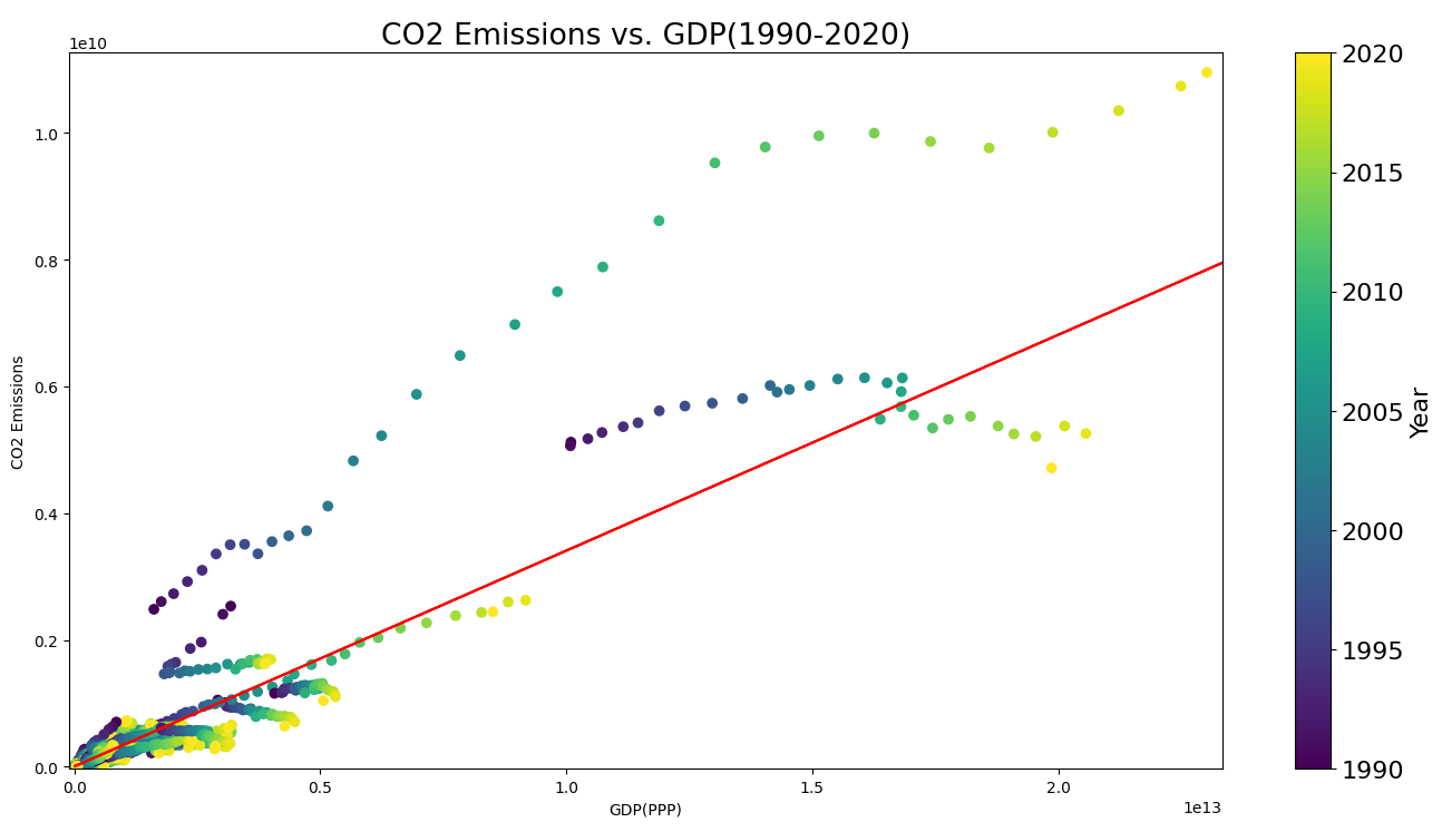
To analyze the correlation between CO2 emissions and GDP measured in PPP, a scatter plot is produced to visualize the data for better understanding as shown in Figure 1. A trend line in red shows the overall growing tendency of world CO2 emissions, which is a positive correlation with GDP. This means that the richer countries are likely to produce more CO2 emissions. The dots are not strictly continuous because they represent different countries.
|
Figure 1. Scatter plot of GDP per capita vs. Annual CO2 emissions. |
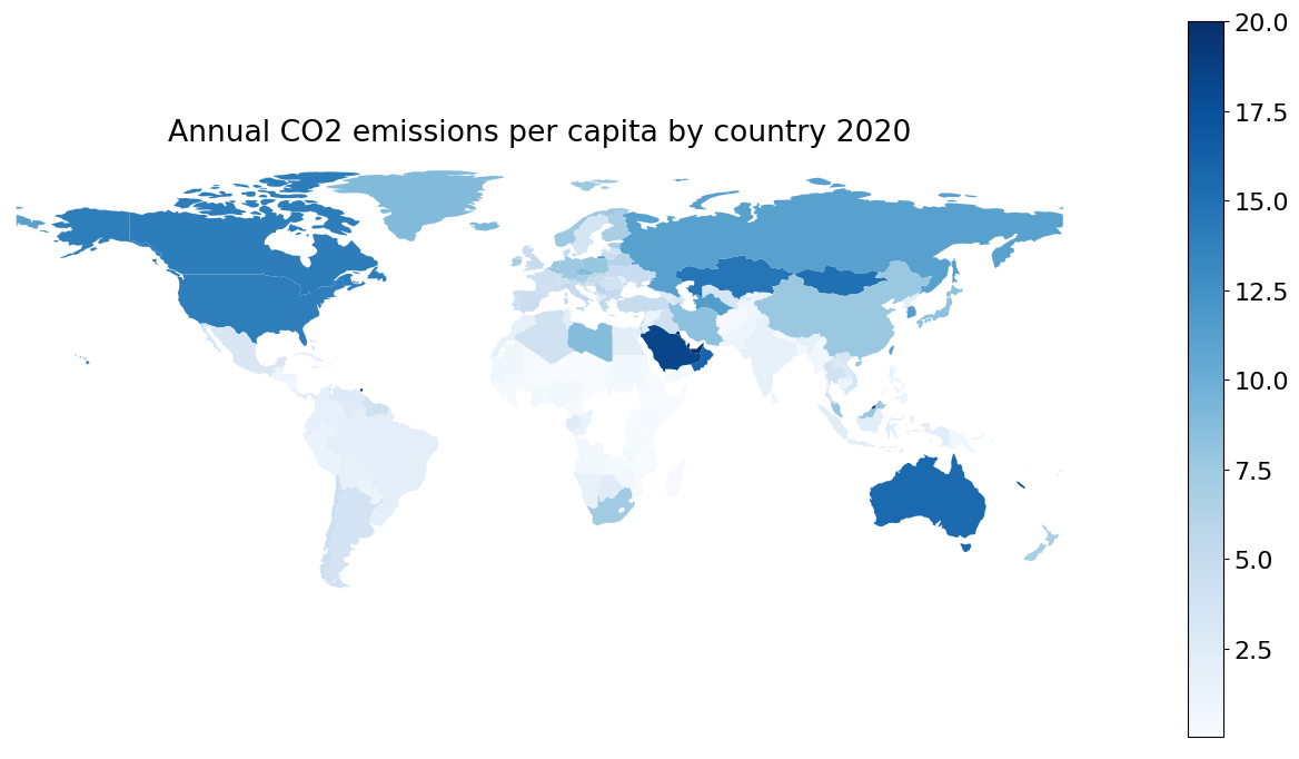
To visualize the annual CO2 emissions per capita of different countries in the world, a Choropleth map is plotted as shown in Figure 2. It is plotted using the geopandas and plotly Python libraries. The deeper the color, the larger the CO2 emissions per capita value. The map makes it easy to infer that developed countries are more likely to have higher CO2 emissions per capita. Western Europe has lower CO2 emissions per capita compared with other developed countries.
|
Figure 2. Choropleth map of annual CO2 emissions per capita. |
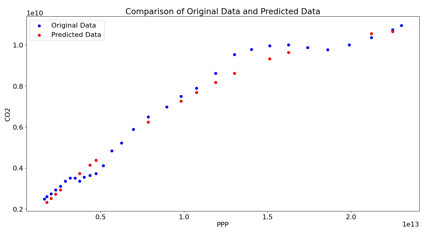
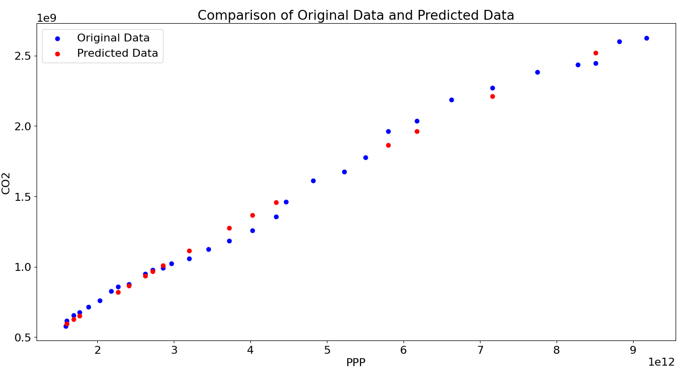
Then a comparison graph of China is plotted by comparing the original data and predicted data from the regression model in Figure 3, it shows a clear correlation between economic growth and CO2 emission. As a developing country, China has been making great efforts to control its CO2 emission while developing industries rapidly, which is one of the main sources of CO2 emissions. The predicted dots are showing a tendency for the emissions to reach maximum and will drop. Though it may not be the real case, it can show general information that the growth rate of CO2 emissions in China is decreasing.
To analyze the situation in European countries, the data of France is selected as an example and the graph plotted is shown in Figure 4. It shows a completely different result compared with China. As a developed country, France has successfully made it possible to lower CO2 emissions while keeping economic growth. This is because France has set a plan to cut its greenhouse gas emissions by 50 percent by 2030 compared with 1990 levels, and it has a high share of nuclear power in its electricity mix, which emits little carbon compared to traditional fossil fuels [14]. Carbon tax and lockdowns because of COVID-19 also reduced the emission from transport, industry and services.
|
Figure 3. Comparison of original data and predicted data in China. |
|
Figure 4. Comparison of original data and predicted data in France. |
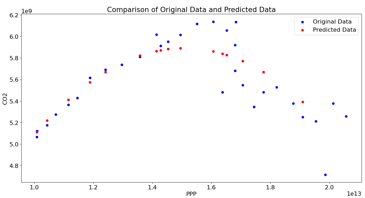
India is chosen as the other example of developing countries in a different phase from China, and the result is shown in Figure 5. As a developing country, India has a large population and CO2 emissions, but it is also taking measures to achieve net zero emissions by 2070 by generating more power from renewable sources and maintaining its forest cover as a carbon sink [15]. Though India is the 3rd biggest emitter of CO2, the per capita emissions are quite low, only 1.9 tons [16]. The graph shows that India’s CO2 emission is in steady increase with economic growth. The predicted polynomial function also showed a peak far away from the range of the graph. This is compatible with the scientific estimation and pledges made by India.
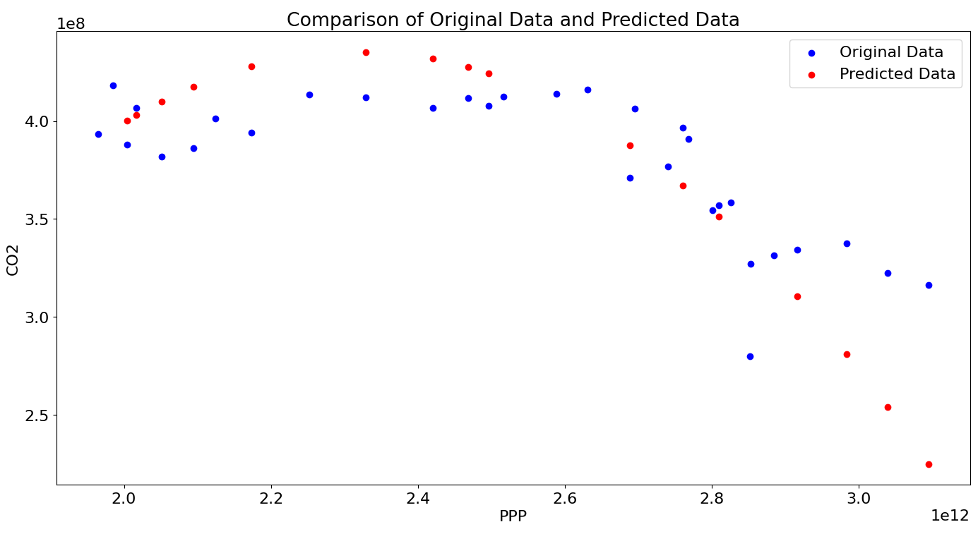
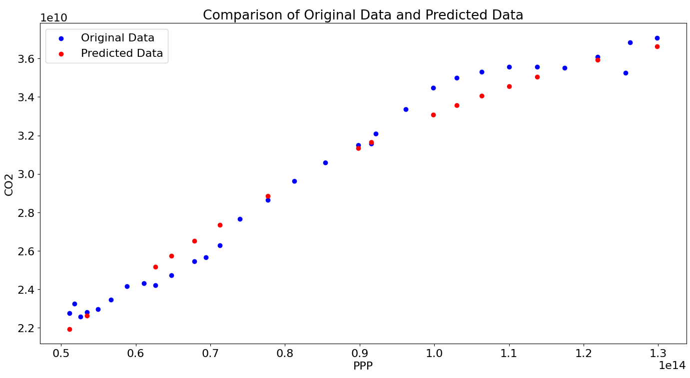
Then the United States of America (the US) is chosen as another example of developed countries as shown in figure 6. A peak can be observed from the graph, which means the US has also succeeded in developing its economy while lowering the overall CO2 emissions. However, as a developed country, the US has a higher per capita emission than most of the world, 15.5 tons. This makes it the 2nd largest CO2 emitter despite its rather small population compared with India and China. In 2021, an increase in CO2 emission is seen in the US, mostly because of the recovery of the country from the pandemic with increased travel, commercial activity, electricity fuel mix, and industrial activity [17].
|
Figure 5. Comparison of original data and predicted data in India. |
|
Figure 6. Comparison of original data and predicted data in the US. |
Finally, to analyze the overall situation of the whole world, the regression model is also trained with the data of the whole world as shown in Figure 7. The overall trend is clearly increasing, and the peak is not in the near futures. This is because there is a lot more population living in developing countries instead of developed countries, especially in Asia, South America, and Africa. These developing countries are more likely to sacrifice some of the environment in exchange for better economic development, and they may not have the ability to use more renewable energy sources instead of fossil fuels because of the technology barrier or economic cost. The global net zero emissions should be reached by 2070 in order to limit global warming to 1.5。C, as called in the Paris Agreement. However, it is challenging work considering the environmental policies across the world and the progress of countries making reductions in their emissions [18].
To better analyze the trend of CO2 emission and GDP growth, the mathematical expression of the polynomial regression model acquired based on the data of the countries mentioned above is shown in equation (1). It is a quadratic function that uses PPP as \( x \) and predicts the CO2 emissions in tons as \( y \) . \( {c_{1}} \) and \( { c_{2}} \) are coefficients fitted by the model and C is the constant term of the quadratic function.
\( y=C+{c_{1}}x+{c_{2}}{x^{2}} \) (1)
|
Figure 7. Comparison of original data and predicted data in the world. |
The exact values of \( C \) , \( {c_{1}} \) , \( {c_{2}} \) of the regression model for the 5 entities considered above are shown in Table 5 for further analysis and calculation. The peak represents the predicted PPP of the entity when it reaches its peak of CO2 emission, which is calculated by applying the formula of the axis of symmetry of the parabola. Compared with the previous figures, it is easy to estimate whether the entity will reach its peach of CO2 emission soon or not, and the data from France and the US can help validate this.
Table 5. Polynomial regression model parameters. | ||||
Entity | C | C1 | C2 | Peak |
China | 6.07E+08 | 8.89E-04 | -1.98E-17 | 2.24E+13 |
India | 2.88E+07 | 3.71E-04 | -9.22E-18 | 2.01E+13 |
France | -5.91E+08 | 8.51E-04 | -1.82E-16 | 2.34E+12 |
To visualize the accuracy of the fitted regression model, the percentage of predicted values within the range of 5% or 10% from the original data is shown in Table 6. Overall, the percentage is very high, which indicates a high accuracy of the regression model.
Table 6. Predicted values accuracy rate. | ||
Entity | Within 5% | Within 10% |
China | 62.50% | 75.00% |
India | 81.25% | 100% |
France | 68.75% | 87.50% |
US | 75.00% | 100% |
World | 93.75% | 100% |
3.3. Discussions
The above figures and tables show the CO2 emissions trend with GDP growth (measured by PPP) in different countries and the world overall. It is evident enough to say that developed countries are more likely to reach their maximum CO2 emissions and start reducing because they need fewer constructions and industrial development to fulfill their needs. Some countries have been able to do this. However, they should still pay attention to their CO2 emissions per capita and take effective measures to control CO2 emissions, since they are usually higher on this and they have already emitted a lot of CO2 in the early ages for their own development. As for developing countries, they usually need more time to reach their peak of CO2 emissions because of the ongoing development including infrastructure constructions and energy supplies. It is reasonable for them to have more time to control their emissions since it is a human right to enjoy a better life by advancing industries. But as members of the global society, developing countries should also pay attention to environmental issues and propose their own solutions, as well as taking efforts to reduce emissions.
4. Conclusions
Using data visualization methods, this paper investigated the relationship between CO2 emissions and GDP growth. The results indicate a positive correlation between the two variables in most countries, suggesting that economic growth may come at the expense of increased carbon emissions. However, some countries have shown the ability to achieve economic growth while reducing their carbon emissions, indicating the possibility of decoupling economic growth and carbon emissions. These findings have important implications for policymakers and businesses seeking to balance economic development and environmental sustainability.
References
[1]. Jarman, M. Climate Change. Fernwood Pub., 2007.
[2]. Monroe, R. “The Keeling Curve.” The Keeling Curve, https://keelingcurve.ucsd.edu/.
[3]. Zhang, W., et al. “How to Coordinate Economic, Logistics and Ecological Environment? Evidences from 30 Provinces and Cities in China.” Sustainability, vol. 12, no. 3, 2020, p. 1058, doi:10.3390/su12031058.
[4]. Congregado, E., et al. “The Environmental Kuznets Curve and CO2 Emissions in the USA: Is the Relationship between GDP and CO2 Emissions Time Varying? Evidence across Economic Sectors.” Environmental Science and Pollution Research International, vol. 23, no. 18, 2016, pp. 18407-18420, doi:10.1007/s11356-016-6982-9.
[5]. Arnold, D.G. The Ethics of Global Climate Change. Cambridge University Press, 2011.
[6]. Andrews-Speed, P., and Zhang, S. China as a Global Clean Energy Champion Lifting the Veil. Springer Singapore, 2019.
[7]. Yang, L. Research on the Allocation of Carbon Dioxide Emission Rights. Shandong Science and Technology Press, 2014.
[8]. Caporale, G.M., Claudio-Quiroga, G., and Gil-Alana, L.A. “Analysing the Relationship between CO2 Emissions and GDP in China: A Fractional Integration and Cointegration Approach.” Journal of Innovation and Entrepreneurship, vol. 10, no. 1, 2021, p. 32, doi:10.1186/s13731-021-00173-5.
[9]. “What is Data Visualization?” IBM, https://www.ibm.com/topics/data-visualization.
[10]. International Monetary Fund. “Climate Change Indicators Dashboard.” https://climatedata.imf.org/.
[11]. Ritchie, H., Roser, M., and Rosado P. “CO₂ and Greenhouse Gas Emissions - Our World in Data.” Ourworldindata.org, Apr. 28, 2020. https://ourworldindata.org/co2-and-other-greenhouse-gas-emissions/.
[12]. “Country, Regional and World GDP (Gross Domestic Product) - Dataset - DataHub - Frictionless Data.” Datahub.io/core/gdp#resource-gdp.
[13]. “Per Capita Co₂ Emissions.” Our World in Data, ourworldindata.org/grapher/co-emissions-per-capita.
[14]. Wires, News. “France Unveils Plan to Cut Greenhouse Gas Emissions by 50 Percent by 2030.” France 24, 22 May 2023, https://www.france24.com/en/france/20230522-france-reveals-plan-to-cut-greenhouse-gas-emissions-by-50-percent-by-2030.
[15]. International Energy Agency. India 2020. IEA, 2020, https://www.iea.org/reports/india-2020.
[16]. “COP26: India PM Narendra Modi Pledges Net Zero by 2070.” BBC News, 2 Nov. 2021, www.bbc.com/news/world-asia-india-59125143.
[17]. "U.S. Energy Information Administration - EIA - Independent Statistics and Analysis." https://www.eia.gov/environment/emissions/carbon/
[18]. "The race to zero emissions, and why the world depends on it | UN News." https://news.un.org/en/story/2020/12/1078612
Cite this article
Fu,X. (2023). Research on the relationship between CO2 emission and GDP growth with data visualization methods. Applied and Computational Engineering,20,78-87.
Data availability
The datasets used and/or analyzed during the current study will be available from the authors upon reasonable request.
Disclaimer/Publisher's Note
The statements, opinions and data contained in all publications are solely those of the individual author(s) and contributor(s) and not of EWA Publishing and/or the editor(s). EWA Publishing and/or the editor(s) disclaim responsibility for any injury to people or property resulting from any ideas, methods, instructions or products referred to in the content.
About volume
Volume title: Proceedings of the 5th International Conference on Computing and Data Science
© 2024 by the author(s). Licensee EWA Publishing, Oxford, UK. This article is an open access article distributed under the terms and
conditions of the Creative Commons Attribution (CC BY) license. Authors who
publish this series agree to the following terms:
1. Authors retain copyright and grant the series right of first publication with the work simultaneously licensed under a Creative Commons
Attribution License that allows others to share the work with an acknowledgment of the work's authorship and initial publication in this
series.
2. Authors are able to enter into separate, additional contractual arrangements for the non-exclusive distribution of the series's published
version of the work (e.g., post it to an institutional repository or publish it in a book), with an acknowledgment of its initial
publication in this series.
3. Authors are permitted and encouraged to post their work online (e.g., in institutional repositories or on their website) prior to and
during the submission process, as it can lead to productive exchanges, as well as earlier and greater citation of published work (See
Open access policy for details).
References
[1]. Jarman, M. Climate Change. Fernwood Pub., 2007.
[2]. Monroe, R. “The Keeling Curve.” The Keeling Curve, https://keelingcurve.ucsd.edu/.
[3]. Zhang, W., et al. “How to Coordinate Economic, Logistics and Ecological Environment? Evidences from 30 Provinces and Cities in China.” Sustainability, vol. 12, no. 3, 2020, p. 1058, doi:10.3390/su12031058.
[4]. Congregado, E., et al. “The Environmental Kuznets Curve and CO2 Emissions in the USA: Is the Relationship between GDP and CO2 Emissions Time Varying? Evidence across Economic Sectors.” Environmental Science and Pollution Research International, vol. 23, no. 18, 2016, pp. 18407-18420, doi:10.1007/s11356-016-6982-9.
[5]. Arnold, D.G. The Ethics of Global Climate Change. Cambridge University Press, 2011.
[6]. Andrews-Speed, P., and Zhang, S. China as a Global Clean Energy Champion Lifting the Veil. Springer Singapore, 2019.
[7]. Yang, L. Research on the Allocation of Carbon Dioxide Emission Rights. Shandong Science and Technology Press, 2014.
[8]. Caporale, G.M., Claudio-Quiroga, G., and Gil-Alana, L.A. “Analysing the Relationship between CO2 Emissions and GDP in China: A Fractional Integration and Cointegration Approach.” Journal of Innovation and Entrepreneurship, vol. 10, no. 1, 2021, p. 32, doi:10.1186/s13731-021-00173-5.
[9]. “What is Data Visualization?” IBM, https://www.ibm.com/topics/data-visualization.
[10]. International Monetary Fund. “Climate Change Indicators Dashboard.” https://climatedata.imf.org/.
[11]. Ritchie, H., Roser, M., and Rosado P. “CO₂ and Greenhouse Gas Emissions - Our World in Data.” Ourworldindata.org, Apr. 28, 2020. https://ourworldindata.org/co2-and-other-greenhouse-gas-emissions/.
[12]. “Country, Regional and World GDP (Gross Domestic Product) - Dataset - DataHub - Frictionless Data.” Datahub.io/core/gdp#resource-gdp.
[13]. “Per Capita Co₂ Emissions.” Our World in Data, ourworldindata.org/grapher/co-emissions-per-capita.
[14]. Wires, News. “France Unveils Plan to Cut Greenhouse Gas Emissions by 50 Percent by 2030.” France 24, 22 May 2023, https://www.france24.com/en/france/20230522-france-reveals-plan-to-cut-greenhouse-gas-emissions-by-50-percent-by-2030.
[15]. International Energy Agency. India 2020. IEA, 2020, https://www.iea.org/reports/india-2020.
[16]. “COP26: India PM Narendra Modi Pledges Net Zero by 2070.” BBC News, 2 Nov. 2021, www.bbc.com/news/world-asia-india-59125143.
[17]. "U.S. Energy Information Administration - EIA - Independent Statistics and Analysis." https://www.eia.gov/environment/emissions/carbon/
[18]. "The race to zero emissions, and why the world depends on it | UN News." https://news.un.org/en/story/2020/12/1078612