


1.Introduction
Nowadays, illustration is being used more and more in various fields, such as game character illustration, book illustration, poster illustration, music cover illustration and so on. The number of industries that require illustration is also increasing, and the applications are quite diverse. Therefore, illustration should not only focus on the surface, but also show the viewer the deeper meaning of the image. Therefore, more illustrations are expressing ideas and emotions in a more personal and artistic way and style.
In order to make the picture better present the ideas and emotions that it is meant to express, the use and matching of colours are very important, because different matching of colours can present different ideas and feelings. Different colours will give the viewer a different visual experience and evoke different emotions. Therefore, in order to accurately express the author’s thoughts and feelings, the illustrator needs to learn to use the right mix of colours and use them wisely to express the atmosphere of the painting.
Therefore, this paper will study the effect of different colors on the visual effect, atmosphere and emotion of an illustration, and analyze which specific color characteristics bring different effects to the picture. Meanwhile, some of the best illustrations are given as examples to analyze the impact of different color combinations and usage on the illustrations.
2.The Concept of Illustration
2.1.Contemporary Definition of Illustration
Illustration, also known as drawing, is generally done by hand, panel, and mouse, and as a result of the rapid development of contemporary digital media, illustration has expanded into many industries. As an essential form of visual communication in contemporary design, illustration has a powerful aesthetic impact. Illustration is now used in many areas of modern design, for example in the design industry, film and animation and games. Illustration is divided into three main categories: photography, painting, and three-dimensional illustration, and has an important place in the art industry as well as being closely linked to commerce, even in industries such as film, television, advertising, and music. These commercially related illustrations are known as commercial illustrations.
2.2.Definition of Colour
Colour is the visual psychological perception caused by the reflection of light from an object to the human eye. Different colours can produce different visual effects, so colour is an essential element in illustration. It can be used to create contrast, to create the atmosphere of the picture and to attract the eye and direct the eye’s attention to the scope of a particular painting. In summary, the efficient use of colour can give a picture more character, tension and expressiveness.
2.3.The Link Between Colour and Illustration
“Among the types of art in the world, the modern art of illustration has something in common with classical Chinese art in terms of its artistic and aesthetic scope. The most significant point is the use of colour and the place it occupies in the work of art. Through the use of colour, it is possible to express the artist’s state of mind and the ideas he wants to express. Each artist has his or her own preference and understanding of colour, and the use of colour is a reflection of the way in which the artist expresses his or her ideas. The subject of an illustration is the character, and the character is often the vehicle for the emotion of the story. When portraying characters, colour not only enriches the visuals, but also improves the decoration. The emotional characteristics of different colours can be used to stimulate the viewer’s emotional experience and directly influence the viewer’s internal perception of the character. Illustrators can use the emotional characteristics of colour to emphasise characters and personas and suggest that viewers form specific perceptions more quickly and accurately in order to perceive the interior of the character the illustrator wishes to portray” [1]. It is thus clear that colour is very important to the picture.
3.Theoretical Knowledge about Colour in Illustration
3.1.The Role and Importance of Colour Theory in Illustration
The theory of colour in illustration is actually very important, even if there is no clear line between good and bad in terms of illustration, because the public has different living environments, different levels of knowledge and different customs, which leads to very different styles and preferred works. So one has to study the trends of the times, the aesthetic preferences of the people, and then combine them with the illustrator’s own unique style to achieve a level of perception that is “somewhat familiar but new” and “within acceptable limits” for most people. However, there are no clear boundaries to colour theory, but there are still some theories that are almost unchangeable, such as the use of bright colours against a dark background to make an object more striking, and the visual influence of the same size square, one black and the other white, where people often believe in the ‘deception’ of the eye. The white square is perceived as larger than the black one. These are good examples of colour theory, which can help illustrators to refine their work.
3.2.The Effect of Different Colours on Human Perception
3.2.1.Warm and Cold Tones
The use of warm and cold tones has a great impact on the mood of the viewer, so illustrators should pay particular attention to the use of warm and cold tones. If the mood is sad, cold or calm, the image is better in cooler tones, whereas if the mood is warm, warm or passionate, the image is better in warmer tones. Here is an example of colour psychology, “Ask two people to do an experiment where one enters a red room with pink wallpaper and a dark red carpet and the other enters a blue room with blue wallpaper and a blue carpet. Without giving them any timer, they were asked to leave the room after one hour by feel. As a result, the person in the red room came out after 40-50 minutes, while the person in the blue room did not come out after 70-80 minutes. Some people said, “This is because the red rooms make people feel uncomfortable, so they feel extra long.” There is indeed a reason for this, but it is not quite true. The main reason is that a person’s sense of time can be disturbed by the colours around them” [2]. This is an example of psychology, but it is also very helpful for illustration, as it tells us that cooler colours make us feel calmer, while warmer colours make us feel more ‘exhilarated’.
There are many ways to use colour temperature in illustration, and there are two main categories of colours that people use to match, warm and cool tones. Illustrators can also use the two together to create a more balanced picture. When putting colours together, the artist or illustrator can use the reference colour wheel to select the colours they need. The colour wheel (as shown in Figure 1) is a very useful tool to show the relationship between colours.
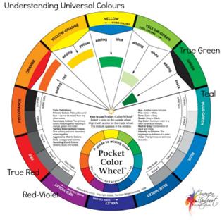
Figure 1: Color Wheel [3].
A very typical painting is given below to explain the theory described above.
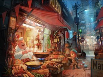
Figure 2: Chef’s Nap [4].
This painting (Figure 2) is from Chef’s Nap by Procreate and the author has used the colour temperature technique in several ways to complete the painting. Firstly, the author has used warm tones to emphasise the shop, while the outside is in a cool blue, a contrast that reflects the warmth of the shop and the deliciousness of the food. Secondly, the author applies the same colour scheme to the interior of the shop, using contrasting colours for the glass door and the little girl’s green hat to give the shop a ‘stronger’ warmth. This, together with the clever composition of the painting, gives the painting a very good visual appearance.
3.2.2.Colour Shades
Colour can be used in many ways to create different effects in an illustration. Not only can shades of colour be used, but shades of colour can also be used to reflect the depth and dimension of the image and to adjust the proximity of the subject in the picture. Often, lighter colours can reflect a sense of space, while darker colours can reflect a sense of intimacy.
There are several ways to use colour to make your illustrations more interesting. One way is to use different shades of the same colour. This can create a sense of depth and dimension in your illustrations. Another way to use colour is to create contrast.

Figure 3: Clinn Artwork [5].
The author’s work is generally greyish in colour, with a light grey background, which gives the image a dull atmosphere while adding space and ‘stretch’ to the image.
3.2.3.Lightness and Heaviness of Colour
The lightness of the colour is mainly related to the shade of the colour. Shallow colours make people think of light things, such as white mist, goose down, snowflakes and many plants, such as cotton and dandelions, which will produce a feeling of softness, fluttering, agility, and flexibility. Darker colours bring to mind hard objects such as solid wood, iron and other items, creating a sense of heaviness and stability in the audience.
3.2.4.Softness and Hardness of Colour
The effect is also derived from the depth of the colour, but there is also a certain relationship with purity. The lighter the colour, the softer it feels, while the deeper it feels, the harder it is. This means that “colours of high brightness and low purity have a soft feel, and colours of medium purity are also soft, because they remind people of the fur of many animals such as camels, foxes, cats and dogs, as well as tweed and fleece fabrics. High purity and low purity colours are both hard, more so if they are low in brightness. Hue has little to do with the softness or hardness of a colour” [6].
3.2.5.Colour Saturation
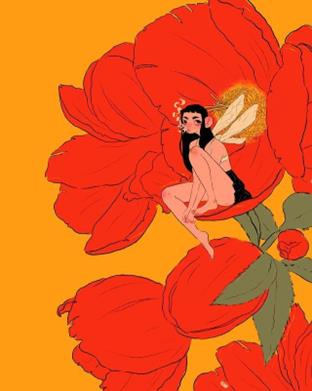
Figure 4: Jasmyn Arnold Artworks [7].
This piece is by Jasmyn Arnold, an illustrator from Michigan, U.S.A. Through her painting, you can see that the colors are highly saturated. The flowers in the picture are highly saturated red, the background is orange and yellow, and the black hair and black dress of the person on the flowers contrast with the color of the flowers, making this painting visually impactful. The combination of red and black gives this painting a strong vintage feel.
When it comes to saturation in illustration, it is important to consider the level of saturation that the illustrator is trying to achieve. More saturated colors will appear brighter and can be used to add vibrancy to the piece, while less saturated colors can give a more subtle, emotionally subdued feel. Illustrators can also use color to create a certain mood in their illustrations.
4.Conclusion
In the coming times, illustration will be used more and more, and today it is also widely used commercially. Ai-generated illustrations exist, using robots to generate illustrations. Today, illustration is used in print and electronic media, commercial venues, public institutions, merchandise packaging, film and TV show posters, corporate advertising, and even T-shirts, diaries and greeting cards. Colour is the first visual impression given to people, and it is through colour that we can more directly feel the atmosphere of the original storyline. The colour palette in the illustration gives the image so much life that it needs to be appreciated and thought about. The results of this study must take into account the following limitations, different countries have different perceptions and feelings about different colors. Therefore, viewers’ perceptions and the emotions given to the colors in illustrations are different. For example, in Japan, green symbolizes fertility, but in Korea, green symbolizes fresh start, youth, new energy, and more. Therefore, these two countries have different perceptions of the color green because of different cultural biases, so when a work full of green illustrations appears, the audience will have different interpretations when they see it. Therefore, when a work full of green illustrations appears, the audience will have different interpretations. Therefore, the color analysis can’t be fully compatible with everyone’s understanding. But a trend can be found in it, which is in line with the perception of most people.
Therefore, future research can get accurate information about color by delving into the cultural practices of a certain country to better show the powerful role of color in illustration.
References
[1]. Wang Fei. The visual language quality of illustration art in the information age [J]. Times Literature (Bimonthly), 2009 (02): 140-142.
[2]. Reijin Harada: A Little Color Psychology Every Day 2009.
[3]. Pinterest, 2023, Universal Colours - How Universal Are They Really? [online] Available at: https://www.pinterest.com/pin/505458758182259901/ [Assessed 18 March 2023].
[4]. Wallpaper Cave,2023, Chef’s Nap[online] Available at: https://wallpapercave.com/w/uwp2714889 [Assessed 18 March 2023].
[5]. Baidu,2023, Clinn Artwork[online] Available at: http://mms0.baidu.com/it/u=949200413,922794414&fm=253&app=138&f=JPEG&fmt=auto&q=75?w=500&h=667 [Assessed 18 March 2023].
[6]. Xu Lu. On colour matching in illustration [J]. China Ethnic Expo, 2017(7):3.
[7]. XinLang,2023, Jasmyn Arnold’s painting of a young girl [online] Available at: https://k.sina.cn/article_1081167004_p40714c9c02700xxfa.html [Assessed 18 March 2023].
Cite this article
Li,J. (2023). The Use of Colour in Illustration. Communications in Humanities Research,16,6-11.
Data availability
The datasets used and/or analyzed during the current study will be available from the authors upon reasonable request.
Disclaimer/Publisher's Note
The statements, opinions and data contained in all publications are solely those of the individual author(s) and contributor(s) and not of EWA Publishing and/or the editor(s). EWA Publishing and/or the editor(s) disclaim responsibility for any injury to people or property resulting from any ideas, methods, instructions or products referred to in the content.
About volume
Volume title: Proceedings of the International Conference on Global Politics and Socio-Humanities
© 2024 by the author(s). Licensee EWA Publishing, Oxford, UK. This article is an open access article distributed under the terms and
conditions of the Creative Commons Attribution (CC BY) license. Authors who
publish this series agree to the following terms:
1. Authors retain copyright and grant the series right of first publication with the work simultaneously licensed under a Creative Commons
Attribution License that allows others to share the work with an acknowledgment of the work's authorship and initial publication in this
series.
2. Authors are able to enter into separate, additional contractual arrangements for the non-exclusive distribution of the series's published
version of the work (e.g., post it to an institutional repository or publish it in a book), with an acknowledgment of its initial
publication in this series.
3. Authors are permitted and encouraged to post their work online (e.g., in institutional repositories or on their website) prior to and
during the submission process, as it can lead to productive exchanges, as well as earlier and greater citation of published work (See
Open access policy for details).
References
[1]. Wang Fei. The visual language quality of illustration art in the information age [J]. Times Literature (Bimonthly), 2009 (02): 140-142.
[2]. Reijin Harada: A Little Color Psychology Every Day 2009.
[3]. Pinterest, 2023, Universal Colours - How Universal Are They Really? [online] Available at: https://www.pinterest.com/pin/505458758182259901/ [Assessed 18 March 2023].
[4]. Wallpaper Cave,2023, Chef’s Nap[online] Available at: https://wallpapercave.com/w/uwp2714889 [Assessed 18 March 2023].
[5]. Baidu,2023, Clinn Artwork[online] Available at: http://mms0.baidu.com/it/u=949200413,922794414&fm=253&app=138&f=JPEG&fmt=auto&q=75?w=500&h=667 [Assessed 18 March 2023].
[6]. Xu Lu. On colour matching in illustration [J]. China Ethnic Expo, 2017(7):3.
[7]. XinLang,2023, Jasmyn Arnold’s painting of a young girl [online] Available at: https://k.sina.cn/article_1081167004_p40714c9c02700xxfa.html [Assessed 18 March 2023].