


1. Introduction
In the digital age, a strong online presence is a cornerstone for the success of businesses across various industries. Architectural firms are no exception. The digital landscape has reshaped the way architectural services are sought after and presented to the world. The importance of a compelling and user-centered digital presence for architectural firms cannot be overstated. As stated, company websites serve not only as an information medium but also to bring the company closer to customers and attract investors [1].
Architectural firms, known for their creative and innovative designs, rely on their portfolios to showcase their expertise and attract potential clients. In an era where information is at our fingertips, clients and architectural enthusiasts expect easy access to detailed project information, aesthetic visual representations, and seamless communication with firms. Recognizing the challenges faced by startups, such as difficulties in staying in business and making a profit, the researcher proposes solutions that resonate with the demands of the digital age. As suggested, one effective solution is to consider redeveloping or creating a new website. A website, defined as a collection of interrelated, publicly accessible web pages, can play a pivotal role in addressing the complexities of organizing services, presenting testimonials, managing order flow, profiles, and providing direct links for user orders [2]. The user interface is very complex consisting of a vast network of pages to be accessed by the user [3]. Therefore, a well-designed and strategically implemented website serves as a powerful tool to meet these expectations.
The primary objective of this research is to delve into the design and implementation of user-focused web pages tailored specifically for architectural firms. This study places a significant emphasis on front-end development, recognizing its pivotal role in creating a captivating and effective user experience. As highlighted by He, post-2005, the Internet transitioned into the Web 2.0 era, witnessing the rise of numerous web applications resembling traditional desktop software. This transformation brought about significant shifts in the landscape of website front-end development [4].
With the increasing popularity of Web 2.0 ideas, enterprises have gradually realized the importance of the front-end. People have higher and higher requirements for user experience, and the technical difficulty of front-end development is also increasing [4]. Therefore, the central aim is to answer the question of how architectural firms can harness the potential of digital platforms to connect with their audience, present their work effectively, and leave a lasting impression. By focusing on user-centered design principles, responsive layouts, and cutting-edge technologies, this study aims to provide architectural firms with insights and guidelines to enhance their digital presence.
Traditional architectural firm websites often suffer from a lack of user-centered focus, with many failing to effectively showcase their portfolios in a manner that engages and retains the audience’s interest. Common issues include static and non-interactive layouts, limited functionality, and a design approach that prioritizes aesthetic over usability. Such limitations not only hinder the effective presentation of architectural works but also lead to inefficient user navigation and a poor overall digital experience. Recognizing these challenges, the objective of this study is to shift the paradigm by introducing innovative solutions. The proposed solutions include interactive and dynamic content presentation, responsive and intuitive design, and the strategic integration of advanced web technologies [5]. This approach aims not only to elevate the aesthetic appeal of the websites but also to significantly enhance their functionality and user engagement, thereby setting a new standard in digital architectural portfolio presentation.
This research narrows its scope to the realm of architectural firms and their online presence. It explores the design and implementation of web pages that cater to the specific needs and expectations of architectural firms’ clients, partners, and enthusiasts. The study prioritizes front-end development as a crucial component in achieving a visually engaging and user-friendly interface.
In today’s increasingly digital landscape, focusing on website design and optimizing user experience is paramount. This applies especially to architectural firms. A well-crafted online platform not only enhances a firm’s competitiveness in the market but also better serves the needs and expectations of modern users.
Architectural firms are recognized for their creativity and innovation in design, making the presentation of their work a critical aspect of their success. An effective website can not only attract potential clients but also engage architectural enthusiasts and showcase the firm’s expertise. As such, this research aims to address the unique challenges and opportunities faced by architectural firms in the digital era.
In conclusion, this study recognizes the fundamental role of a compelling digital presence for architectural firms and sets out to explore the design and implementation of user-focused web pages, with an emphasis on front-end development.
2. Method
2.1. Website Design
The website design of construction companies should focus on user engagement and interactive experience. The layout and navigational structure were conceptualized to provide an intuitive and informative journey through the firm’s ethos, projects, and contact information. The design methods, as shown in Figure 1, for the architectural website involve thorough research, including interviews, field studies, focus groups, questionnaires, and bench-marketing. The concept phase employs brainstorming, keyword identification, mood board creation, and project concept development. Design focuses on structural sketches, prototyping, icon design, and adherence to UX guidelines. Evaluation includes usability tests and assessments, ensuring the website meets both aesthetic and functional requirements. These methods form a comprehensive framework for the creation of an engaging and user-centered architectural website.
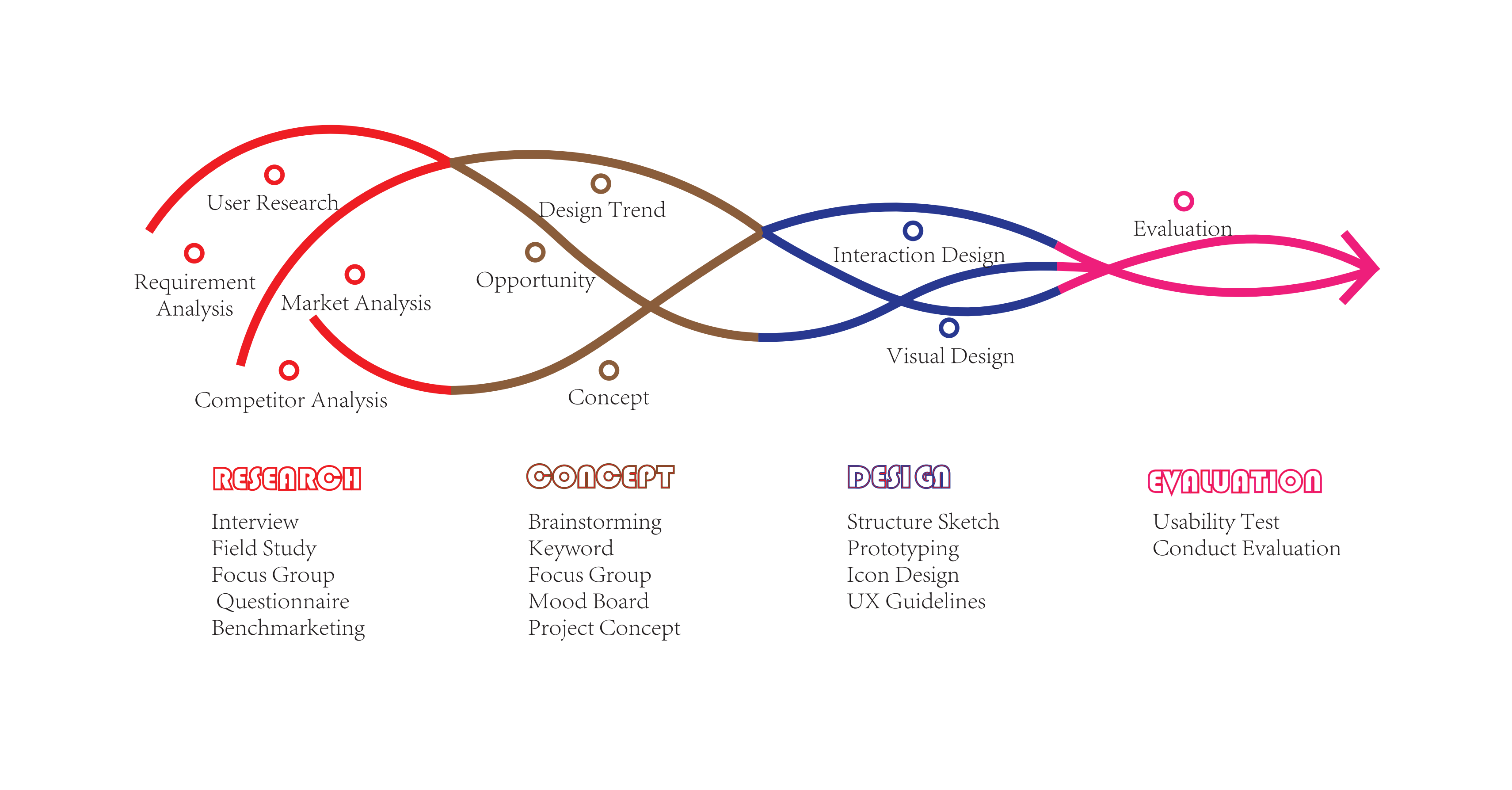 Figure 1. Design process and methods.
2.1.1. Layout and Aesthetics. The website’s design adopts a minimalist approach, emphasizing clean lines, uncluttered spaces, and a neutral color palette. This aesthetic choice aligns with the architectural firm’s focus on modernism and simplicity in their designs. The minimal layout not only enhances the visual appeal but also ensures that the website is easy to navigate, providing a smooth user experience.
Visual elements are central to the website’s design, with high-quality images of architectural projects taking prominence. The use of large, striking visuals serves to immediately capture visitors’ attention and effectively convey the firm’s expertise in architectural design.
The homepage features a unique arrangement of keywords such as ‘Time’, ‘Space’, ‘Self’, ‘Nature’, and ‘Feel’, strategically positioned to draw attention and intrigue. Each keyword, reflecting a core aspect of the firm’s philosophy, is interactive – hovering over them reveals additional content or leads to specific sections of the site. This interactivity engages users and encourages exploration, allowing for a deeper understanding of the firm’s approach and values.
Recognizing the diversity of devices used to access the website, a responsive design approach is employed. This ensures that the layout and aesthetics are maintained across various screen sizes and devices. The responsive design not only improves accessibility but also demonstrates the firm’s commitment to modernity and adaptability.
2.1.2. Navigation. The website features a responsive navigation menu at the top, designed to provide users with easy and intuitive access to various sections of the site. The menu’s design is minimal, aligning with the overall aesthetic of the site, and is positioned prominently to be immediately noticeable to visitors.
A key feature of the navigation system is the fixed menu icon (☰), commonly known as a hamburger icon, located at the top of every page. Its fixed position ensures that it is accessible from any part of the website, providing a consistent and reliable way for users to access the menu regardless of their position on the page. This design choice enhances the site’s usability, especially for users who navigate through long pages.
Upon clicking the menu icon, users are presented with a structured and well-organized layout of the site’s main sections: ‘Architectural Design’, ‘Engineering Design’, ‘Consultancy’, ‘BIM Services’, and ‘Contact Us’. Each section is clearly labeled, making it easy for users to find and navigate to the specific area of the site they are interested in. This structured approach reduces the cognitive load on users and improves the overall navigational experience.
The navigation menu is not just a static list of links but includes interactive elements that enhance user engagement. For instance, hovering over a menu item may reveal sub-items or a brief description of what users can expect to find in that section, providing context and aiding in navigation decisions.
2.2. Development Technologies
Java-based system web development typically follows a three-tier architecture, as depicted in Figure 2, encompassing the client side, front-end, and back-end components. On the client side, web browsers serve as the interface for end-users to interact with the system. The front-end, implemented using technologies like JSP, HTML, Cascading Style Sheets (CSS), and JavaScript, focuses on presenting a user-friendly interface and handling user interactions. The back-end, powered by Java technologies such as Java Servlets, manages the server-side logic, data processing, and database interactions. This modular architecture mirrors the design of the web application described in our scenario, where the client section engages with users through an online platform, while the server section efficiently manages server-side tasks, including data processing and database interactions [6].
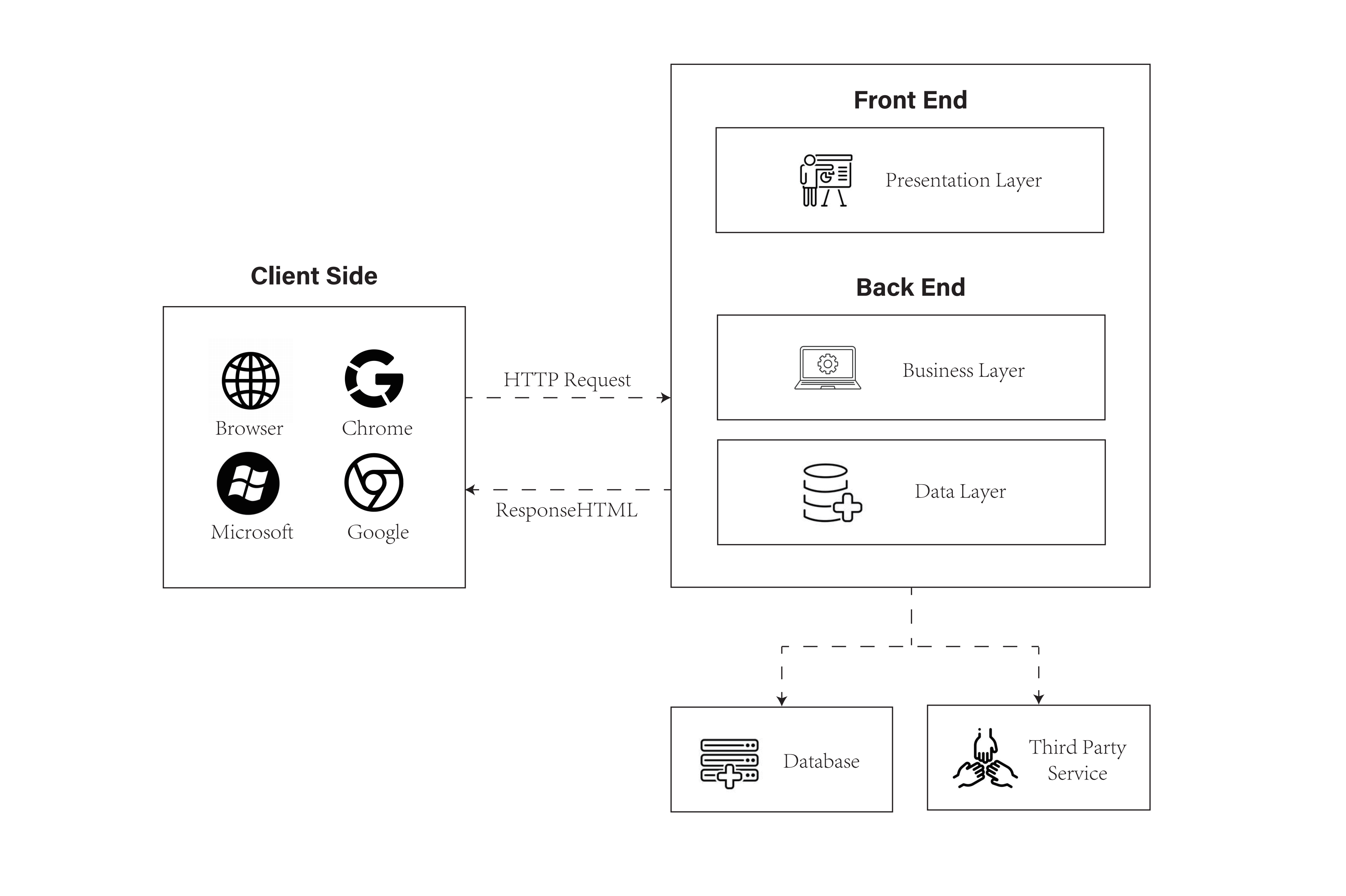
Figure 2. Java-based web development architecture.
In detail, the website was developed using JSP for server-side rendering, with CSS and JavaScript enhancing the client-side experience. JSP allowed for the dynamic generation of web pages, where server-side logic is embedded into HTML. This was particularly utilized for the interactive keywords and the content they reveal upon interaction.
CSS played a crucial role in the aesthetic design of the website. CSS determined the way the page was displayed, defining the location, size, and effect of the elements on the page, contributing significantly to the overall rendering of the web [7]. The application of CSS extended to the layout of the navigation menu, the styling of the keywords, and the overall color scheme and typography, ensuring consistency with the architectural firm’s branding.
JavaScript played a crucial role in enhancing the interactivity of the website. It was used for the drop-down functionality of the navigation menu, the display of related content by hovering over keywords, and the smooth scrolling feature for a seamless user experience.
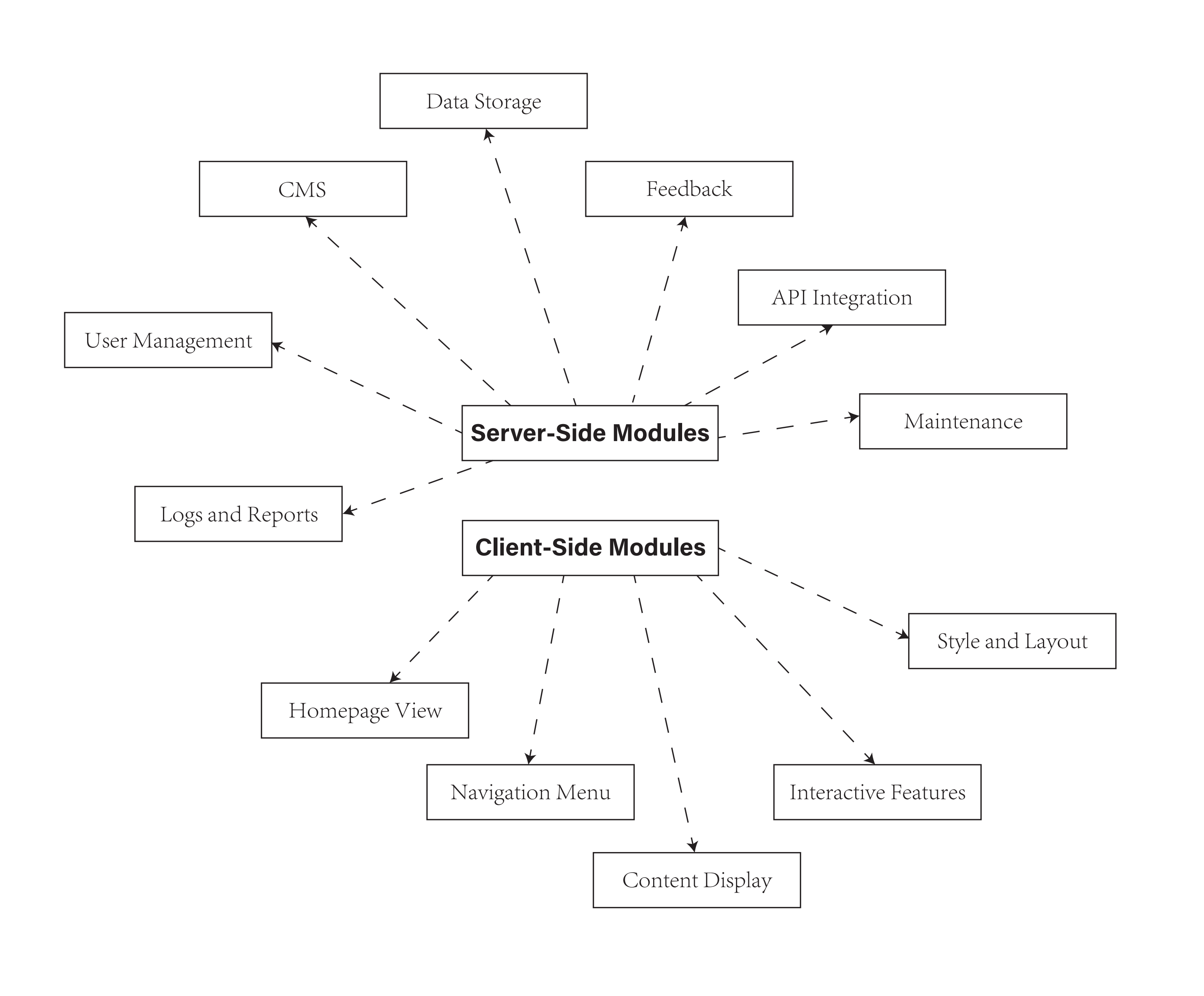
Figure 3. Functional modules.
2.3. Architectural Work Showcase
The key feature in the web page functional modules, as shown in Figure 3, is the “Architectural Work Showcase”, which is presented in a horizontally scrolling gallery.
2.3.1. Gallery Design. The gallery was designed to display images of the firm’s projects in a horizontal scroll layout. Each image fits the viewport width to ensure full visibility without the need for vertical scrolling.
2.3.2. Automatic Scrolling Feature. An automatic scrolling function was implemented using JavaScript. This feature enables the gallery to continuously scroll horizontally, providing an engaging way to view the firm’s portfolio.
3. Design and Implementation Process
3.1. Initial Conceptualization
3.1.1. Needs Assessment. The project began with a comprehensive needs assessment to understand the architectural firm’s objectives, target audience, and key messages. Analyzing competitors and users highlighted the need for a website that not only showcases the firm’s portfolio but also conveys its unique design philosophy and approach to architecture. The target audience was identified as potential clients, architects, and students interested in architectural design.
3.1.2. Design Strategy. A design strategy was formulated to create an interactive and informative website that aligns with the firm’s brand identity. The strategy focused on achieving a balance between visual aesthetics and functional usability. It aimed to engage users through interactive elements like clickable keywords and a dynamic project gallery while ensuring ease of navigation and content accessibility [8]. This strategic approach is crucial for the successful development of a website that aligns with the firm’s brand identity and effectively communicates its design philosophy and approach to architecture.
3.2. Website Architecture and Layout
3.2.1. Information Architecture. The website’s information architecture was designed to offer intuitive navigation and a logical flow of content. The main sections included were Home, About Us, Portfolio, Services, and Contact. Each section was planned to provide relevant information clearly and concisely, with the Home page serving as a hub for user interaction and exploration [9].
3.2.2. Wire-framing. As shown in Figure 4, wire-frames for each web page were created to provide a visual guide for the layout. This included the placement of elements such as headers, footers, navigation bars, and content areas.
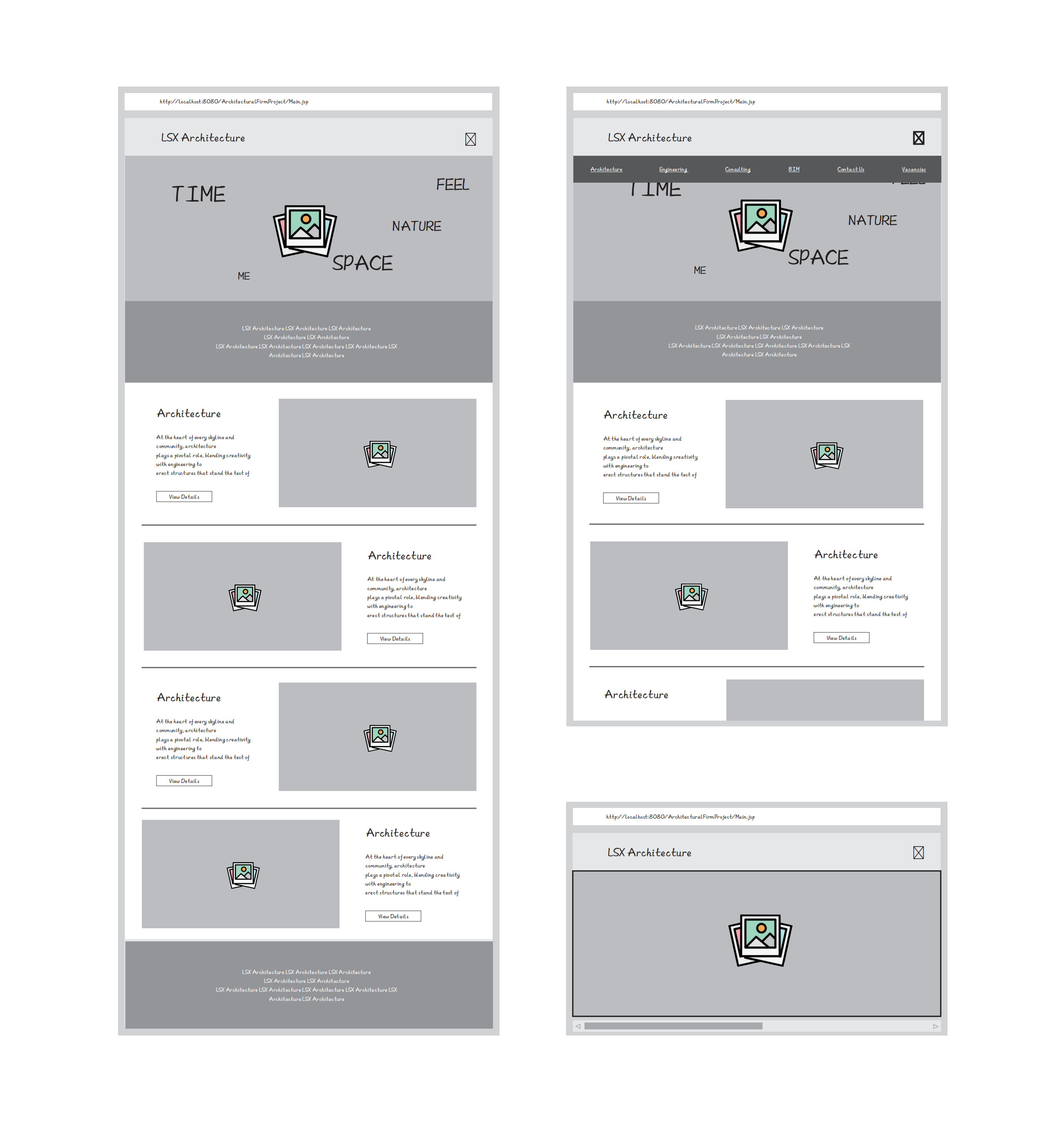
Figure 4. Wire-frame structure.
3.2.3. Visual Design. The aesthetic aspects, including color schemes, typography, and imagery, were designed to align with the architectural firm’s brand identity. A balance between visual appeal and functionality was maintained. Visual design is integral to the overall interface quality, exerting a continuous impact on the user’s interaction with the interface [10].
3.2.4. Final Design. The final design incorporates all the elements, styles, and functionality. It reflects the user requirements, guiding principles, and feedback received throughout the design phases.
3.3. Development Phase
3.3.1. Front-End Development. The website’s front-end was developed using HTML, CSS, and JavaScript. This phase involved coding the visual designs into a functional website, ensuring it was responsive and compatible with various browsers and devices.
3.3.2. Back-End Integration. JSP was utilized to handle dynamic content and server-side functionalities. This included developing server scripts to manage content, user interactions, and data storage.
3.3.3. Content Integration. Architectural projects, company information, and other relevant content were integrated into the website. This included high-quality images of architectural works, descriptive texts, and interactive elements.
3.4. Interactive Features Implementation
3.4.1. Interactive Keywords. The homepage featured interactive keywords, which were implemented to enhance user engagement. JavaScript was used to create hover effects and dynamic content display based on user interactions, as shown in Table 1.
3.4.2. Mouse Over (‘mouseover’). Displays related text when the mouse hovers over a keyword. This text, retrieved from the ‘data-related’ attribute, is shown in the ‘related-content’ element.
3.4.3. Mouse Out (‘mouseout’). Hides the ‘related-content’ element when the mouse leaves a keyword.
3.4.4. Click (‘click’). Navigates the browser to the link specified in the ‘data-url’ attribute upon clicking a keyword.
Table 1. Interactive keyword codes.
Event Listener | Definition |
‘DOMContentLoaded’ | This event is triggered when the initial HTML document has been completely loaded and parsed, without waiting for stylesheets, images, and sub-frames to finish loading. |
‘forEach’ | Executes a provided function once for each array element. In this case, it iterates over each element with the class ‘keyword’. |
‘mouseover’ | This event is triggered when the mouse pointer enters the element. In this context, it’s used to display related content when hovering over a keyword. |
‘mouseout’ | This event is triggered when the mouse pointer leaves the element. It’s utilized to hide the related content when the mouse is not over a keyword. |
‘click’ | This event is triggered when the element is clicked. In this case, it navigates to the URL associated with the clicked keyword. |
‘window.location.href’ | Represents the URL of the current page. Changing it redirects the browser to the specified URL. |
1) Responsive Navigation Menu. A responsive navigation menu was implemented, allowing users to easily access different sections of the website. Special attention was given to ensuring its usability across different device sizes, as shown in Table 2.
This script sets up a click event listener for the ‘.menu-icon’ element. When the menu icon is clicked by a user, the display state of the ‘.menu’ element toggles between being visible (‘block’) and hidden (‘none’). This implementation results in a responsive navigation menu, allowing users to control the display of the menu via the icon.
Table 2. Responsive navigation menu codes.
Event Listener | Definition |
‘DOMContentLoaded’ | This event is triggered when the initial HTML document has been completely loaded and parsed, without waiting for stylesheets, images, and sub-frames to finish loading. |
‘querySelector’ | Returns the first element that matches a specified CSS selector in the document. In this case, it selects the element with the class ‘menu-icon’. |
‘addEventListener’ | Attaches an event handler to the specified element. In this context, it listens for a ‘click’ event on the element with the class ‘menu-icon’. |
‘click’ | This event is triggered when the element is clicked. |
‘querySelector’(second usage) | Selects the element with the class ‘menu’. |
‘style. display’ | Gets or sets the value of the CSS display property. It’s toggled between ‘block’ and ‘none’ based on its current value, effectively showing or hiding the menu. |
2) Portfolio Gallery. An interactive portfolio gallery was developed to showcase the firm’s architectural projects. This included implementing a horizontally scrolling gallery, with emphasis on smooth scrolling and image optimization for faster loading times, as shown in Table 3.
This part of the code adds click event listeners to each link (‘<a>‘ tag) in the menu. When a link is clicked, it prevents the default navigation action and smoothly scrolls to the specified element on the page with the corresponding ‘id’. This is achieved by reading the ‘href’ attribute of the link and using the ‘scrollIntoView’ method, creating a user-friendly smooth scrolling experience.
Table 3. Portfolio gallery codes.
Event Listener | Definition |
‘DOMContentLoaded’ | This event is triggered when the initial HTML document has been completely loaded and parsed. |
‘querySelectorAll’ | Returns a NodeList of all elements in the document that match a specified CSS selector. In this case, it selects all anchor (‘<a>‘) elements inside elements with the class ‘menu’. |
‘forEach’ | Executes a provided function once for each element in the NodeList. |
‘addEventListener’ | Attaches an event handler to each anchor element. It listens for a ‘click’ event on each anchor. |
‘click’ | This event is triggered when an anchor element is clicked. |
‘e.preventDefault()’ | Prevents the default action of the anchor, which is navigating to another page. |
‘getAttribute(‘href’)’ | Gets the value of the ‘href’ attribute of the clicked anchor, representing the target element’s ID. |
‘document.querySelector’ | Selects the element with the ID equal to the value of the ‘href’ attribute. |
‘scrollIntoView’ | Scrolls the target element into the visible area of the browser window with a smooth animation. |
3) Automatic Horizontal Scrolling. An “Automatic Horizontal Scrolling” interaction is designed to control the visual effect of an automatic horizontal scroll for the gallery of works, facilitating a quick and efficient way for users to view architectural projects, as shown in Table 4.
Initialization:
·The variable ‘works’ is assigned to the ‘.works’ DOM element.
·’scrollAmount’ is initialized to 0, representing the starting point of the scroll.
‘autoScroll’ Function:
·This function is responsible for the scrolling action.
·It checks if ‘scrollAmount’ has exceeded the width of the ‘works’ element
‘works.offsetWidth’). If so, it resets the scroll position back to the start and sets ‘scrollAmount’
back to 0.
·If not, it increments ‘scrollAmount’ by 1 pixel, then applies a negative translation (‘translateX’)
to the ‘works’ element equal to ‘scrollAmount’. This creates the effect of the content moving
leftward.
Continuous Scrolling:
·’setInterval(autoScroll, 20)’ is used to repeatedly call the ‘autoScroll’ function every 20
milliseconds. This results in a continuous, smooth scrolling motion.
Table 4. Automatic horizontal scrolling codes.
Event Listener | Definition |
‘DOMContentLoaded’ | This event is triggered when the initial HTML document has been completely loaded and parsed. |
‘document.querySelector(‘.works’)’ | Selects the first element with the class ‘works’ in the document. |
‘var scrollAmount = 0;’ | Initializes a variable scrollAmount to 0. |
‘function autoScroll()’ | Defines a function named autoScroll. |
‘if(scrollAmount >= works.offsetWidth)’ | Checks if the accumulated scroll amount is greater than or equal to the width of the ‘works’ element. |
‘works.style.transform = ‘translateX(0)’;’ | Resets the horizontal scroll position to the beginning. |
‘scrollAmount = 0;’ | Resets the scroll amount to 0. |
‘else’ | Executes the following code if the condition is not met. |
‘scrollAmount += 1;’ | Increments the scroll amount by 1 pixel in each iteration. |
‘works.style.transform = ‘translateX(‘+-scrollAmount + ‘px)’;’ | Translates the ‘works’ element horizontally by the negative of the scroll amount. |
‘setInterval(autoScroll, 20); | Calls the autoScroll function at intervals of 20 milliseconds, creating an automatic horizontal scroll effect. |
4. Results and Discussions
4.1. Functionalities Implemented in the Case Study
4.1.1. Technical Features. 1) Interactivity with JSP: The use of JSP enabled dynamic content rendering, allowing the website to respond to user actions effectively. Key technical features included interactive keywords, a responsive gallery, and a navigation menu. 2) Seamless Integration of CSS and JavaScript: The combination of CSS for styling and JavaScript for functionality resulted in a smooth user experience. The interactive elements like hover effects and smooth scrolling were pivotal in enhancing the site’s technical robustness [11].
4.1.2. User Interaction. 1) User Engagement through Interactive Keywords: The implementation of interactive keywords on the homepage significantly improved user engagement. Each keyword, when hovered over or clicked, provided additional information or navigation options, keeping users engaged and informed. 2) Streamlined Navigation: The site’s navigation was designed to be intuitive and user-friendly, allowing easy access to all sections of the website without overwhelming the users.
4.2. UX Enhancements and Innovations
Improved Visual Design: 1) The visual design of the site, with its modern and clean aesthetics, provided an enhanced user experience compared to traditional layouts. This design approach highlighted the firm’s projects and philosophy effectively. 2) Optimized for Performance and Accessibility: Special attention was given to the site’s performance and accessibility, ensuring quick load times and ease of access for all users, including those with disabilities.
4.3. Comparison with Traditional Architectural Websites
4.3.1. Emphasis on Projects. This website differs from traditional architectural websites by placing less emphasis on textual content. Instead, it prioritizes the presentation of architectural projects using high-quality images and interactive galleries, creating a more immersive experience (Figure 5).
4.3.2. User-Friendly Design. The website outperformed traditional architectural websites in terms of user navigation. The layout was organized and clutter-free, with clear calls to action, making it easier for users to find the information they needed.
4.3.3. Mobile Responsiveness. The website was fully responsive, ensuring that it adapted seamlessly to different device sizes, from desktops to smartphones. This responsiveness addressed the common issue in many traditional architectural websites of poor mobile user experience.
|
|
(a) | (b) |
|
|
(c) | (d) |
|
|
(e) | (f) |
|
|
(g) | (h) |
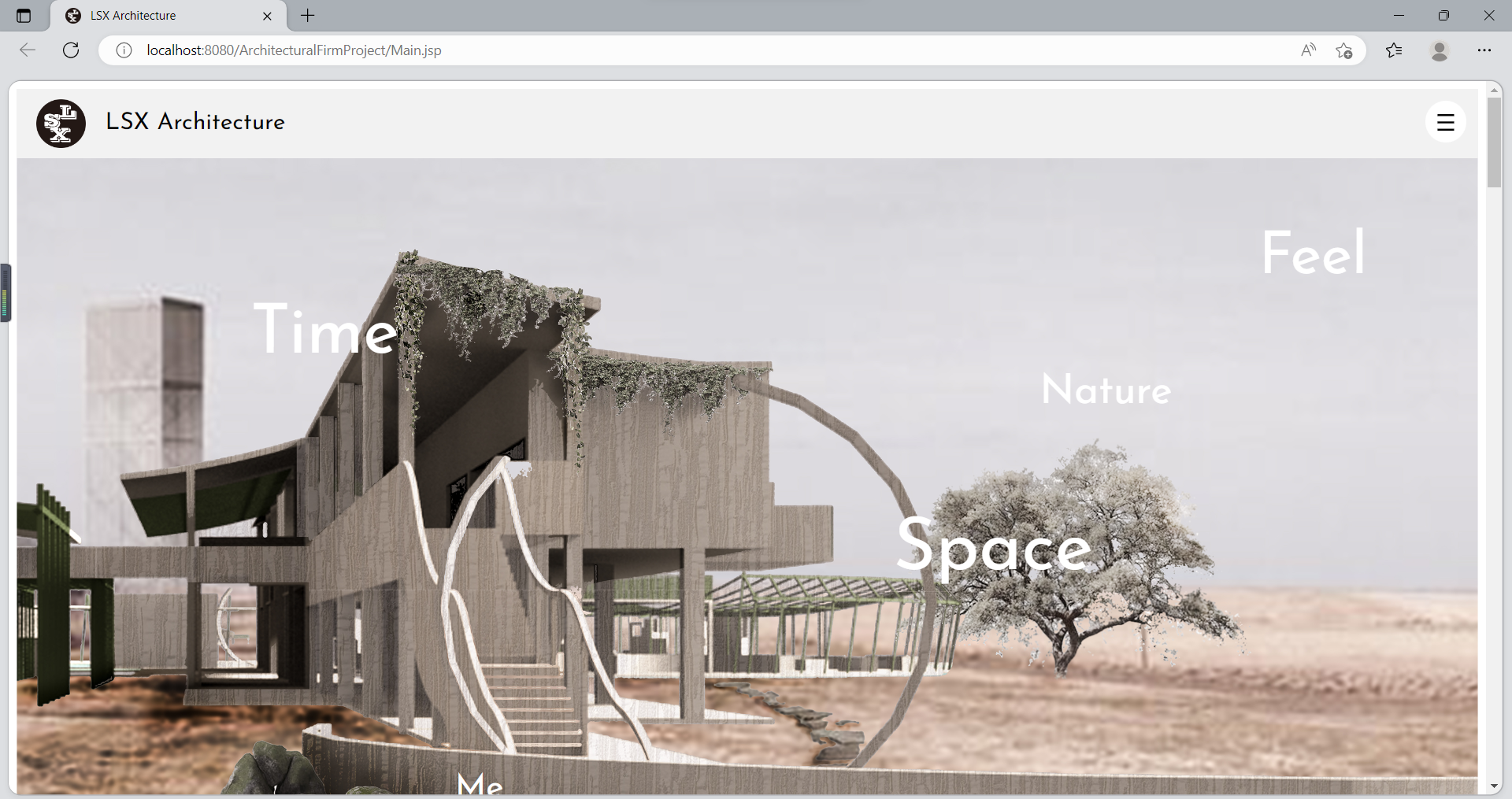
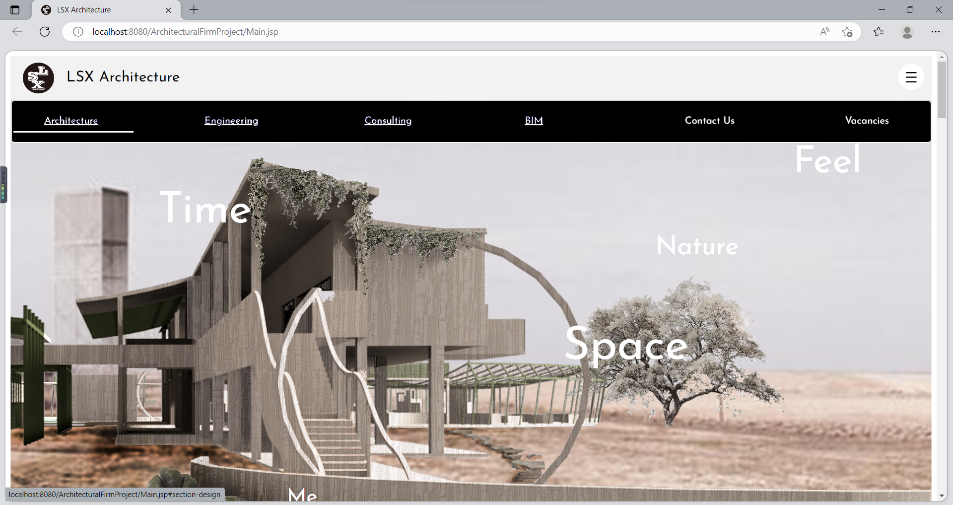
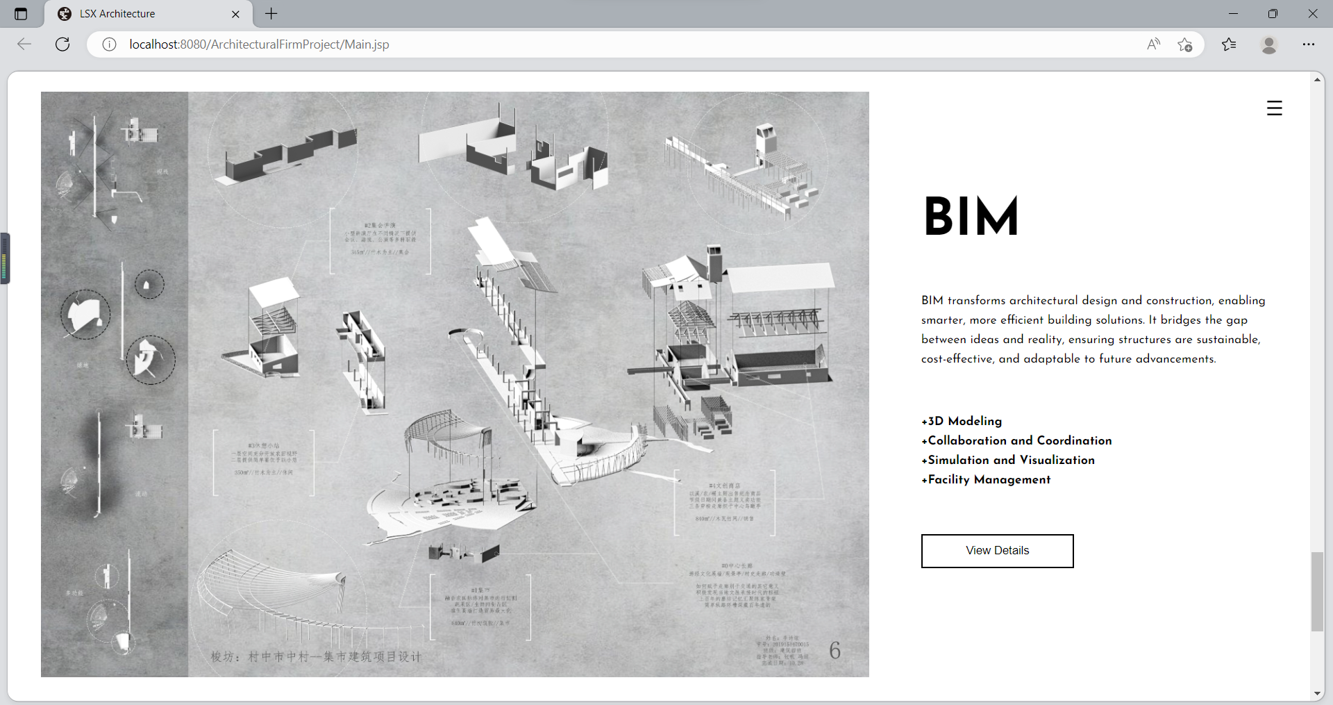
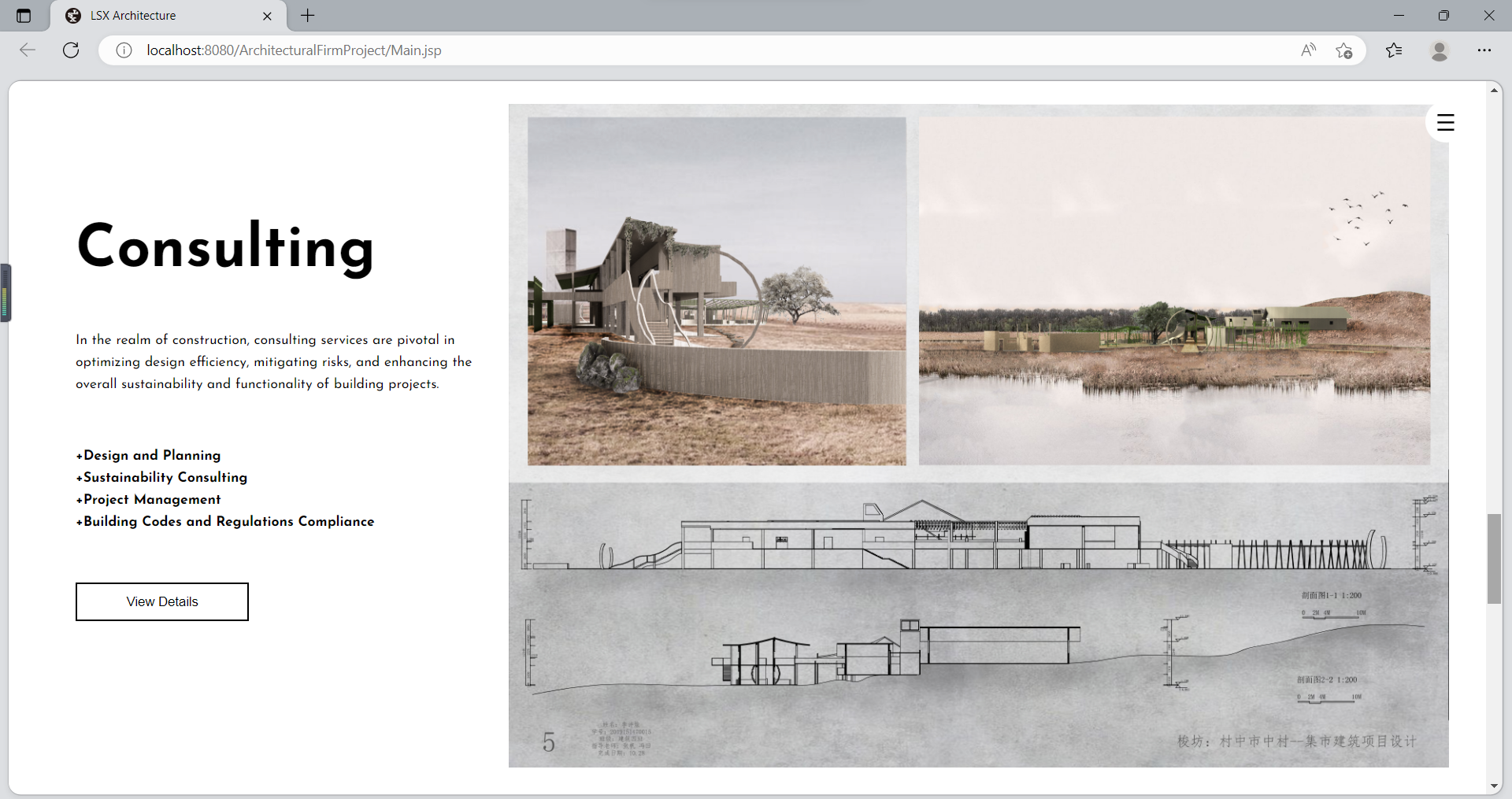
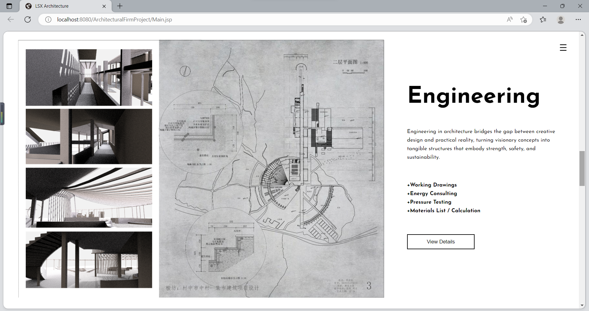
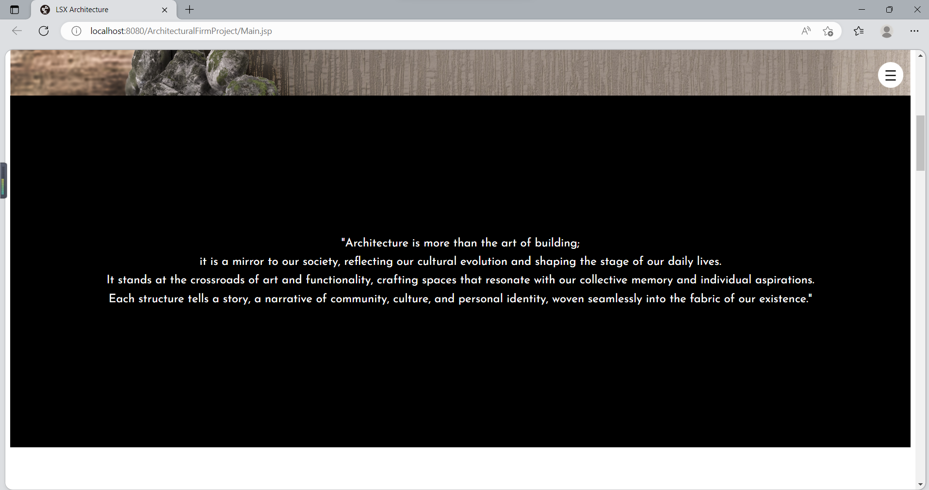
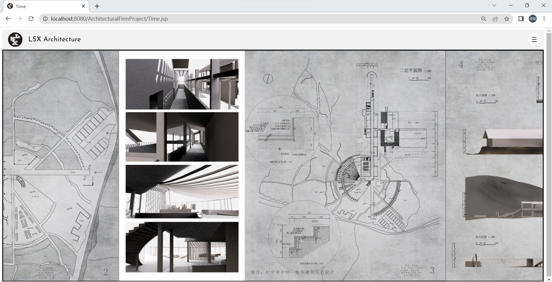
Figure 5. Partial web Pages display. (a) Main page; (b) Menu section page; (c) Architecture section page; (d) BIM section page; (e) Consulting section page; (f)Engineering section page; (g) Quote section page; (h) Portfolio gallery page.
5. Conclusion
This paper specifically addresses the critical challenge of effectively showcasing architectural works within the digital landscape. The research involved developing a user-centered website, focusing on how architectural firms can better connect with their audience and present their work compellingly online. This study resulted in the creation of a prototype website that emphasizes responsive design, interactive elements like dynamic galleries and scrolling features, and the strategic use of user feedback. These elements proved crucial in enhancing the digital presence of architectural firms, allowing for a more engaging and informative user experience.
However, the research presented in this study has certain limitations. One key area where the study falls short is in its exploration of mobile-first design principles. Given the growing prevalence of mobile internet usage, a mobile-first approach is increasingly vital for reaching a broader audience. Furthermore, the study does not fully delve into the potential application of emerging technologies, such as Virtual Reality and Augmented Reality, in the presentation of architectural works. These technologies offer promising avenues for creating even more immersive and interactive user experiences.
For future research, it is recommended to focus on several aspects. Firstly, the application of mobile-first design in architectural websites should be explored to adapt to the growing mobile user base. Secondly, the use of virtual reality and augmented reality technologies in architectural works should be investigated. Thirdly, serious consideration should be given to integrating AI-based chat-bots into construction websites to provide a more personalized user experience and customer service. Lastly, integrated marketing communications can serve as a valuable approach to achieving a clear, consistent, and compelling message about architectural services, thus contributing to the overall effectiveness of the communication plan. By addressing these limitations, future research can expand on the findings of this study, exploring new frontiers in digital architectural presentations and further enhancing the user experience in architectural websites.
In conclusion, while this research has made significant strides in enhancing the digital representation of architectural firms, it also opens new avenues for future exploration. The integration of advanced technologies and a stronger emphasis on mobile-first design principles could further revolutionize how architectural firms interact with their audience in the digital domain. This study not only showcases the potential of current web technologies in the field of architecture but also sets the stage for future innovations in digital architectural presentations.
References
[1]. Yudhanto Y Pryhatyanto W M and Sulandari W 2022 2022 1st International Conference on Smart Technology Applied Informatics and Engineering (APICS) Surakarta Indonesia
[2]. Yudhanto Y Susilo S A and Sulandari W 2022 2022 1st International Conference on Smart Technology Applied Informatics and Engineering (APICS) Surakarta Indonesia
[3]. Deshmukh S Mane D and Retawade A 2019 2019 3rd International Conference on Computing Methodologies and Communication (ICCMC) Erode India
[4]. He J 2023 2023 2nd International Conference for Innovation in Technology (INOCON) Bangalore India
[5]. Kolomoyets M and Kynash Y 2023 2023 IEEE 18th International Conference on Computer Science and Information Technologies (CSIT) Lviv, Ukraine
[6]. Syaifudin Y W Funabiki N Mentari M Saputra P Y Yunhasnawa Y Ulfa F and Kuribayashi M 2021 Proceedings of the Annual Technical Applied Science and Engineering Conference Malang Indonesia IOP Conference Series: Materials Science and Engineering 1073 012060
[7]. Cao B Shi M and Li C 2017 2017 10th International Congress on Image and Signal Processing BioMedical Engineering and Informatics (CISP-BMEI) Shanghai China
[8]. Dagumboy E C 2019 Journal of Communication Studies 3 287
[9]. Bunian S Li K Jemmali C Harteveld C Fu Y and Seif El-Nasr M S 2021 Proceedings of the 2021 CHI Conference on Human Factors in Computing Systems (New York: Association for Computing Machinery) p 1
[10]. Chen C H and Zhai W IEEE Access 11 47024
[11]. Cao J October 13 2020 How to Use the Best UI Design Patterns https://www.uxpin.com/studio/blog/useright-ui-design-patterns/
Cite this article
Li,S. (2024). Design and implementation of architectural websites based on Java: A case study of architectural firm website. Theoretical and Natural Science,34,42-53.
Data availability
The datasets used and/or analyzed during the current study will be available from the authors upon reasonable request.
Disclaimer/Publisher's Note
The statements, opinions and data contained in all publications are solely those of the individual author(s) and contributor(s) and not of EWA Publishing and/or the editor(s). EWA Publishing and/or the editor(s) disclaim responsibility for any injury to people or property resulting from any ideas, methods, instructions or products referred to in the content.
About volume
Volume title: Proceedings of the 3rd International Conference on Computing Innovation and Applied Physics
© 2024 by the author(s). Licensee EWA Publishing, Oxford, UK. This article is an open access article distributed under the terms and
conditions of the Creative Commons Attribution (CC BY) license. Authors who
publish this series agree to the following terms:
1. Authors retain copyright and grant the series right of first publication with the work simultaneously licensed under a Creative Commons
Attribution License that allows others to share the work with an acknowledgment of the work's authorship and initial publication in this
series.
2. Authors are able to enter into separate, additional contractual arrangements for the non-exclusive distribution of the series's published
version of the work (e.g., post it to an institutional repository or publish it in a book), with an acknowledgment of its initial
publication in this series.
3. Authors are permitted and encouraged to post their work online (e.g., in institutional repositories or on their website) prior to and
during the submission process, as it can lead to productive exchanges, as well as earlier and greater citation of published work (See
Open access policy for details).
References
[1]. Yudhanto Y Pryhatyanto W M and Sulandari W 2022 2022 1st International Conference on Smart Technology Applied Informatics and Engineering (APICS) Surakarta Indonesia
[2]. Yudhanto Y Susilo S A and Sulandari W 2022 2022 1st International Conference on Smart Technology Applied Informatics and Engineering (APICS) Surakarta Indonesia
[3]. Deshmukh S Mane D and Retawade A 2019 2019 3rd International Conference on Computing Methodologies and Communication (ICCMC) Erode India
[4]. He J 2023 2023 2nd International Conference for Innovation in Technology (INOCON) Bangalore India
[5]. Kolomoyets M and Kynash Y 2023 2023 IEEE 18th International Conference on Computer Science and Information Technologies (CSIT) Lviv, Ukraine
[6]. Syaifudin Y W Funabiki N Mentari M Saputra P Y Yunhasnawa Y Ulfa F and Kuribayashi M 2021 Proceedings of the Annual Technical Applied Science and Engineering Conference Malang Indonesia IOP Conference Series: Materials Science and Engineering 1073 012060
[7]. Cao B Shi M and Li C 2017 2017 10th International Congress on Image and Signal Processing BioMedical Engineering and Informatics (CISP-BMEI) Shanghai China
[8]. Dagumboy E C 2019 Journal of Communication Studies 3 287
[9]. Bunian S Li K Jemmali C Harteveld C Fu Y and Seif El-Nasr M S 2021 Proceedings of the 2021 CHI Conference on Human Factors in Computing Systems (New York: Association for Computing Machinery) p 1
[10]. Chen C H and Zhai W IEEE Access 11 47024
[11]. Cao J October 13 2020 How to Use the Best UI Design Patterns https://www.uxpin.com/studio/blog/useright-ui-design-patterns/